
News of the group
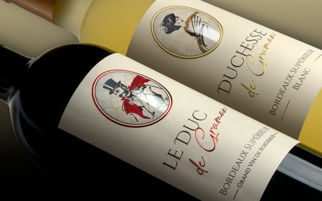
The Duke and Duchess have chosen the volume offered by the Fresnel Lens
The Duc et Duchesse de Graman wine is a truly iconic brand that embodies the elegance and excellence of the French terroir. From a prestigious estate, located in the heart of the most famous wine region of the country. The labels of the Duc et Duchesse de Graman wines...
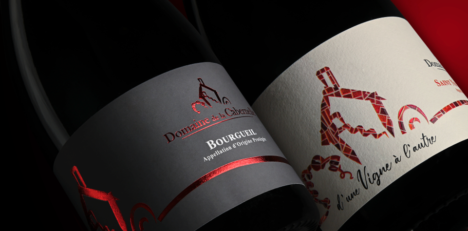
Focus on the Domaine de la Cabernelle labels
Located on the hillside of Bourgueillois, in an idyllic setting, La Cabernelle designates the grouping of 2 estates: the domain of Pontonnier in Saint-Nicolas, and the domain Caslot sur Bourgueil.The resulting vineyard has been exclusively grown organically since 2012...
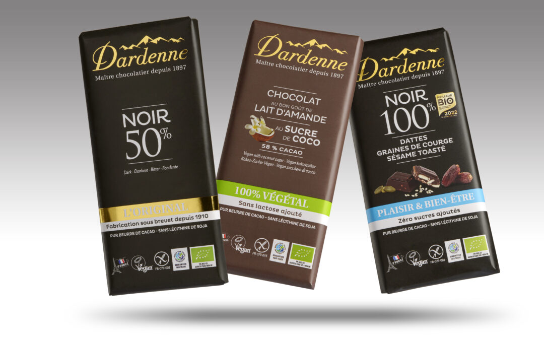
Dardenne chocolates want to be elegant
The packaging of Chocolat Dardenne embodies elegance and sophistication, while capturing the very essence of this delicious sweetness.With clean lines and a subtle color combination, these packaging immediately attract attention and arouse the desire to discover what...
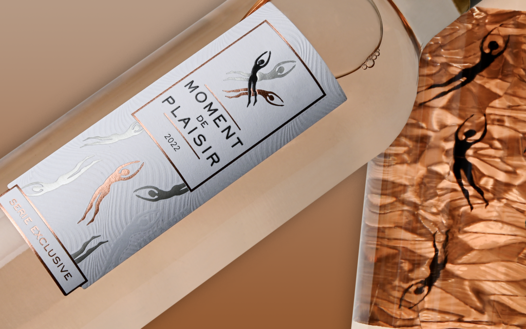
Innovation, a moment of pleasure
A cuvée that bears its name well, because it is a real moment of pleasure that the tasting offers us. Very quickly, this cuvée established itself as a best seller, much appreciated. A rosé for sharing, fruity and intense, with a beautiful, very light rose petal...
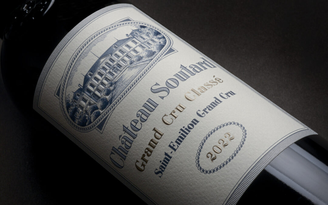
Château Soutard, a very elegant wine
Château Soutard Grand Cru Classé 2022 is an exceptional wine that perfectly embodies the elegance and finesse of the great wines of Bordeaux. From the first glance, its deep and intense red color attracts attention, revealing all the concentration and richness of this...
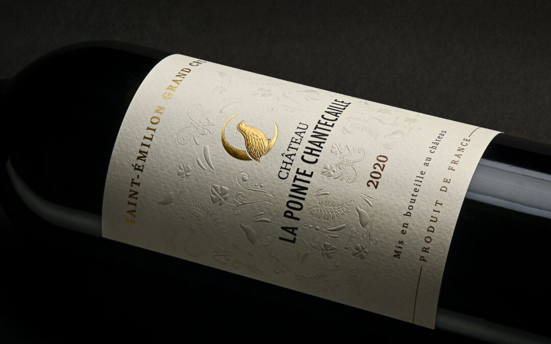
A Pointe Chantecaille, a wine, a place, a work
Imagine a wine that captures the essence of a place, a true work of art. Its aromas of flowers and red fruits intertwine to create an enchanting bouquet. You breathe in raspberry, cherry and spices, a sensory symphony. This Saint Emilion is dazzlingly delicate and...
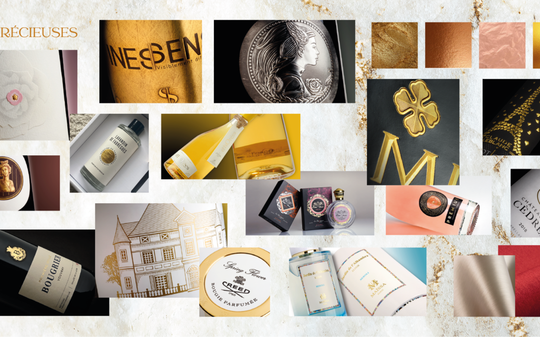
Discover a tactile world with INESSENS : Trend n°4 The Precious
The fourth trend, The Precious, highlights the sophistication of packaging.Labels rooted in tradition are evolving into precious and elegant labels, ‘à la française’. We even see in this trend the creation of high-end packs (specific glassware, reassuring but refined...
CLARENS PREMIUM: A reduction in carbon emissions equivalent to 13 times around the earth by plane!
By choosing Clarens Premium White as an alternative to the major printing standards, our customers have enabled us to avoid the rejection of more than 44.6 tonnes of carbon since the start of its launch in January 2023, i.e. the equivalent of 44 round trips Paris-New...
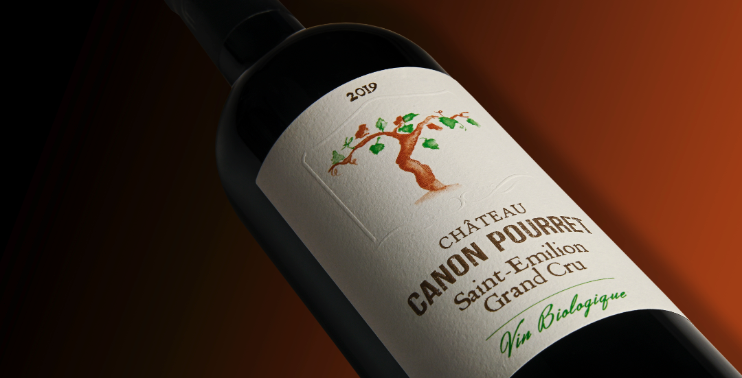
An eco-designed Saint Emilion
Located in Bordeaux, on the right bank of the Dordogne, the village of Saint Émilion dominates from all its height a historic wine region. Canon Pourret, one of the references of this appellation, entrusted us with their new label, created and designed in eco-designed...
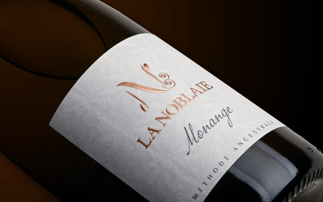
Domain La Nobalie trusts Inessens
It is a fantasy initiated in 2008, the unique marriage of Chenin and Cabernet Franc offering a fine bubble and a vinous finish, that the LA NOBLAIE domain offers.This year, LA NOBLAIE offers itself a new label, and trusts Inessens, which has printed this label on an...