
As every year, the Pantone Institute has unveiled its flagship colour of the year and the nuances that will accompany it.
After Very Peri in 2022, while rumours were tending to favor the Digital Lavender, Pantone chose a fire color for 2023: it’s the Viva Magenta that will set the tone!
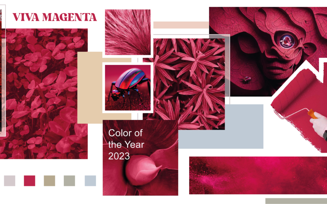
This is a deep and intense red, with dark pink shades, giving the hue vigor and vibrancy.
Based on magenta, the hottest primary color, Viva magenta is distinguished by its depth, it is unique and original, bright and dynamic!
Rooted in the natural descent of the red family, it is inspired by the red of the scale, a precious natural dye that produces a red of rare intensity. It expresses a new signal of strength.
A bold, vibrant and exhuberant colour which fosters a joyful and optimistic celebration.
Today, bright colors are very trendy, very present and palpable in the world of fashion, communication, and interior design. Often very saturated, they are not discreet by nature and bring personality to a project. It inevitably attracts attention! This 2023 pantone expresses this trend!
How is the Pantone color chosen?
40 specialists from various professions who chose Viva Magenta by examining trends in the fields of fashion, cinema, television, design, politics and world events, in order to choose THE color that meets current expectations.
With this color, they want to “reconnect inspirations to nature and create a disconnect with technology” that is now ubiquitous in our daily lives.
To highlight this new colour, Pantone partnered with the company Huge which delivered visuals created using the artificial intelligence tool Midjourney. A nod to the virtual world called sharecroppers that the Pantone Color Institute has nicknamed «Magentavers».
For three decades now, Pantone’s announcement of the colour of the year has been eagerly awaited by creatives around the world. The American company strives to reflect the world we currently live in through each new hue.
Which colors to associate with Viva Magenta?
Like every year, Pantone has unveiled the Viva Magenta color universe: the Magentaverse. A color palette to sublimate its color of the year. Facing this powerful rose, Pantone offers sober and soft shades, flirting with the pastel.
To adopt Viva magenta, we put first on clear neutrals. The essential neutral color of the year is the sand color, which combines with elegance this rose full of vigor. The alternative is a very light grey, a mute color that highlights its subtlety.
Viva Magenta has a pronounced floral facet. To play with it, we combine lilac or lavender shades, clear or more sustained, flirting with grey.
In order to refresh the atmosphere, we love the subtle shades of green, including the shades of khaki green.
A wide range of colors that will titillate all creative people!