
News of the group
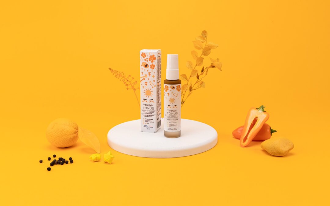
A colourful collaboration with the REBAUD & ROLHION laboratory
We accompanied the birth of the "Les Bienfaits" range of LABORATOIRE REBAUD & ROLHION, which are food supplement sprays sold in pharmacies. We assisted them in the design and production of their boxes and labels on our printing houses Art & Sens and Digit...
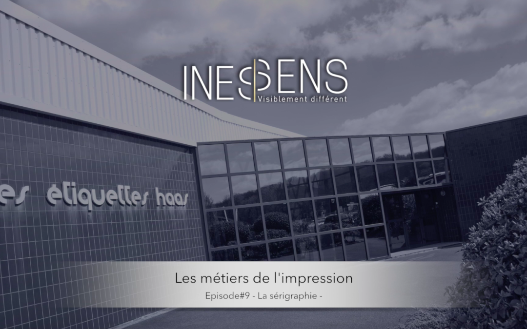
With the 9th episod of our web serie
With the 9th episod of our web serie, discover our method of screen printing at our printing house HAAS. Discover the video here: To contact us, CLICK HERE, or by phone 04 68 76 37 37 and by mail contact@inessens.fr. #video #webseries #printing #etiquette #youtube #...
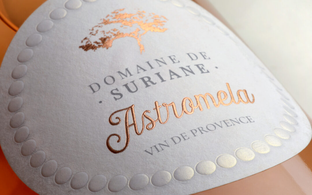
A touch of softness and feminity
Magnificent label for our client DOMAINE DE SURIANE, who wanted to highlight her rosé cuvée, with a touch of femininity. The pearly transparent gilding, which gives a neat and elegant finish to the border, and a choice of rounded characters, allow balance and...
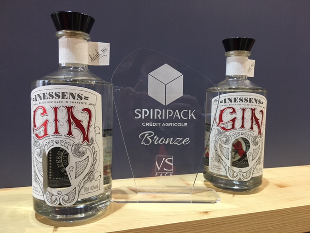
Spiripack Award for our GIN!
Spiripack Award for our GIN! We are very proud to have received the bronze Spiripack at the VS pack fair last week.A great reward for our sense of innovation!To contact us, CLICK HERE, or by phone 04 68 76 37 37 and by mail contact@inessens.fr.
Japanese Art
Our customer wanted to renew the design of the cases for the Japanese market.We proposed a more eco-friendly solution by replacing the Pantone Metallic with a selective screen printing varnish tested on the flower decorations of their limited edition developed...
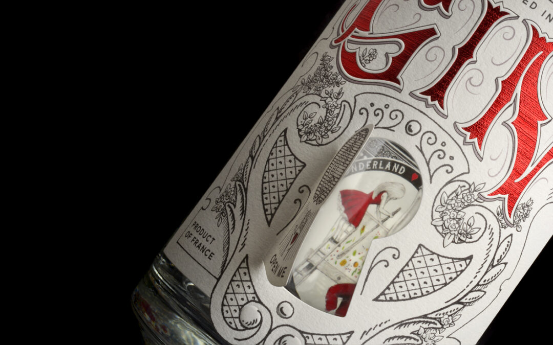
A more than innovative concept of GIN by INESSENS!
This GIN was designed and developed by INESSENS to offer a unique experience to the consumer who is invited to share the manufacturing secrets of the product. We have chosen Cognac partners to help us. An offbeat design by @virginie.drahonnet who knew how to express...
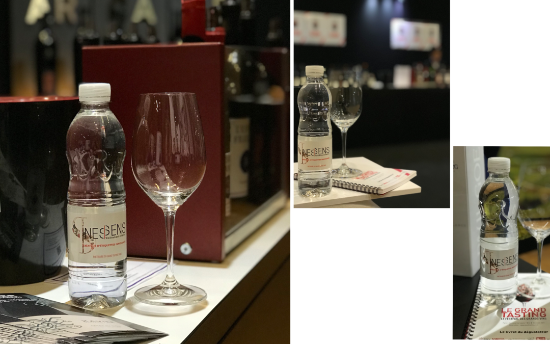
INESSENS is a partner of the GRAND TASTING CARROUSEL DU LOUVRE
Nearly 300 wine producers are gathering at the Carrousel du Louvre for the new edition of this event.For all wine lovers, the Grand Tasting is the unique opportunity to taste the best wines in the world and meet the winemakers who produce them on December 3 and...
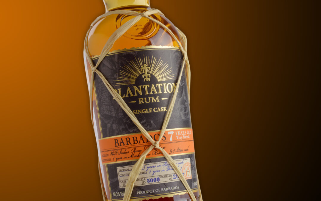
Singularity for the haute couture of rum
Recently produced at our Digit Labels printing house in Cadaujac, our client FERRAND wanted to create uniqueness for the labels of its limited range, Plantation Single Cask. For this, variable data technology was used, allowing 90,000 unique labels to be produced! To...
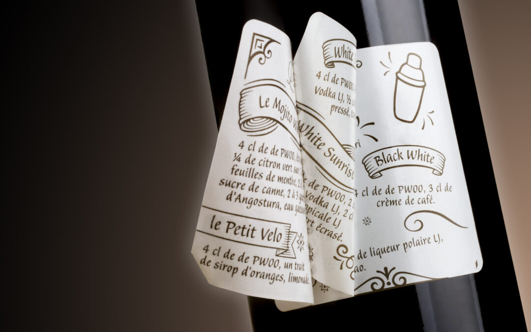
A peel off label to create link with consumers!
Our client Domaine de la Haille wanted to modernise the label of its Pure White 00 Armagnac. Their wish was to dust off the traditional codes of Armagnac to reach a younger public, fond of cocktails.Thanks to the format, which brings a playful side, he revisits the...
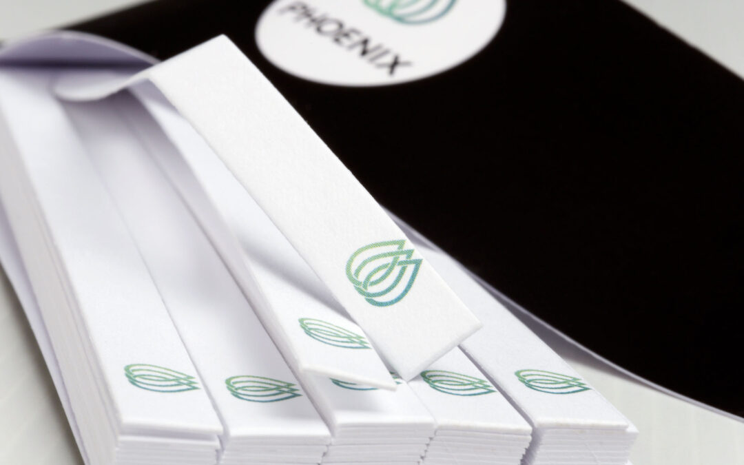
Our booklet of blotters, a reliable tool for professionals
A booklet of blotters is the perfect tool for laboratories or at trade shows. The smelling strips are detachable and easy to handle. The perfume card used to make them allows an optimal olfactory rendering. Our customer Phoenix Aromas, based in England and US explains...