
News of the group
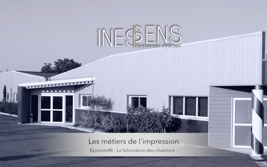
This time, find out how our silkscreens are made, the tools that allow us to print in silk-screen printing.
Lionel, at our Bidoit printing house in Cognac, explains all the stages in the design of our silkscreens.Discover the video here: https://youtu.be/xNNCwGkpaug
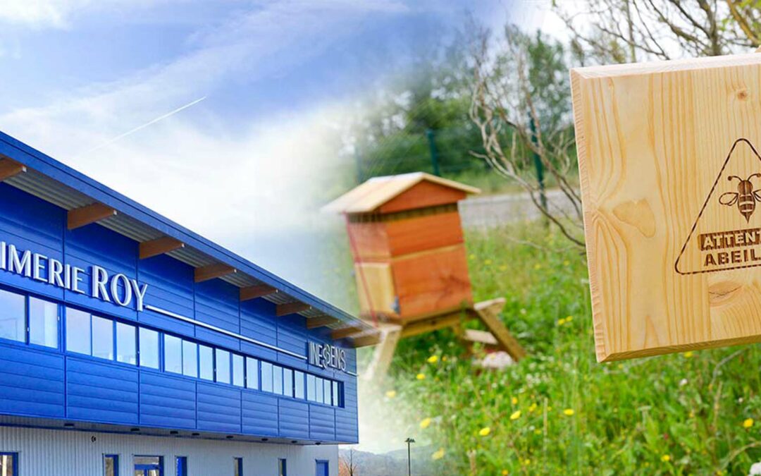
Printing company Roy is involved in the conservation of pollinators in its local environment
In the spring, the Roy print shop adopted bees 😊Why did we do this?This fits perfectly with our CSR approach, by participating in the conservation of pollinators in our environment, and the benefits on the flora.Hosting beehives in our print shop is a committed act in...
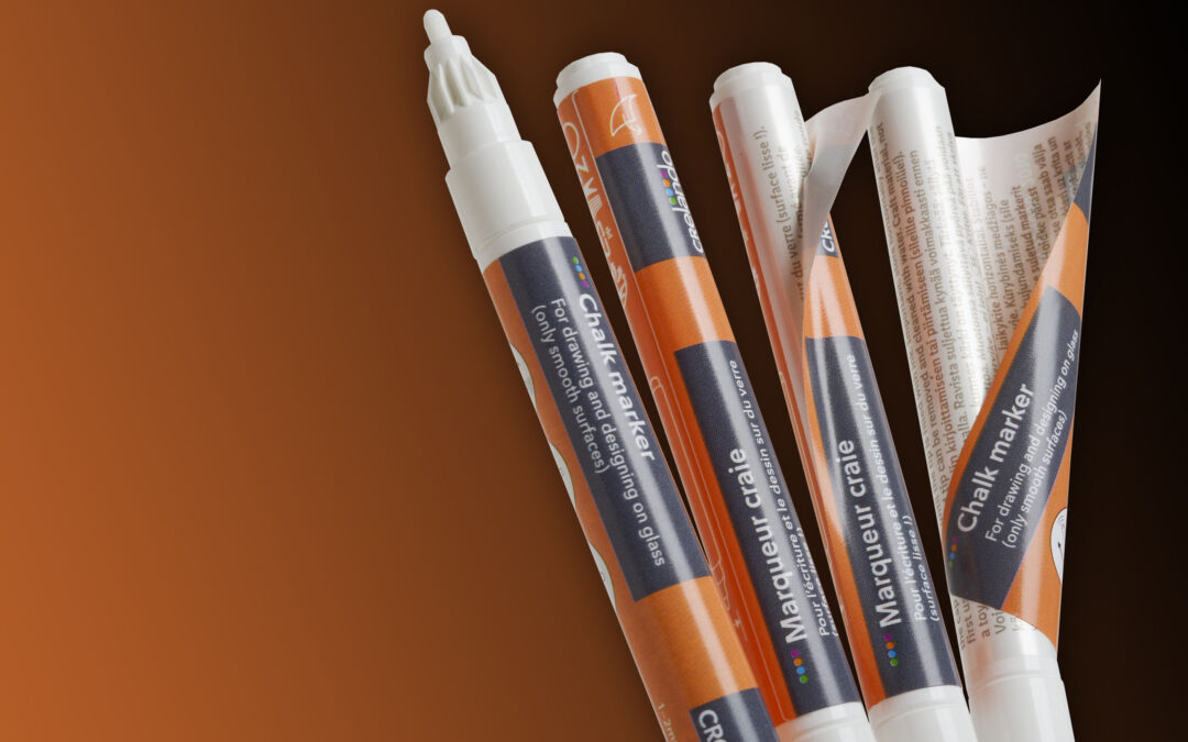
Peel off labels for a larger surface of communication!
Depending on the surface of the product, a label can quickly become too small… That's why peel off labels are a real asset for small formats! This is exactly why our German customer Ratio Plast chose this model for their CRELANDO pencils. By wrapping around the...
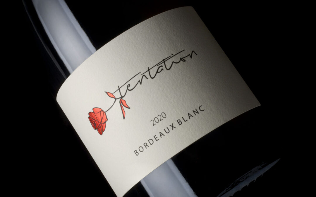
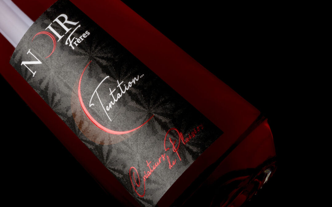
A modernisation that can’t be ignored!
The Vignerons des Coteaux de l'Isle wished to rejuvenate the label of their cuvée Tentation: the goal, a label that is both elegant and distinguished, simple but effective! The red hotfoil enhances the rose and gives a touch of colour to the label, and the name of the...
A textured and elegant paper
The Domaine de la Petite Marne in the heart of the Jura has developed a new red Macvin, which is a liqueur wine made from Trousseau and old fine Jura grapes, aged in oak barrels. To distinguish this rare cuvée, the NOIR brothers chose an innovative support: the "LUCKY...
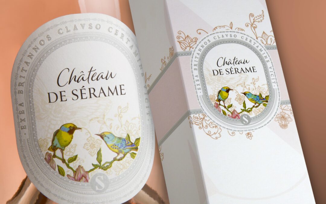
Why not a gift box to highlight your wine
Château de Sérame wanted us to develop the label for its Rosé Grande Cuvée as well as its gift box and neck band! Our client entrusted us with a complete project and we are delighted! A very beautyful design for this Rosé Grande Cuvée, the result of the partnership...
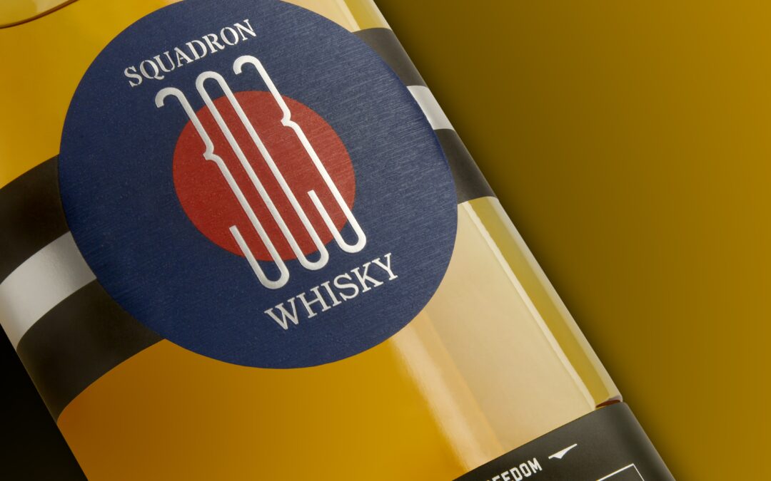
From history, the best is the slogan of our client SQUADRON 303!
Our client SQUADRON 303 is a true history and aviation enthusiast and has entrusted us with the development of its SQUADRON WHISKY 303 labels.Franck Botbol says: "Marianne and her team at the BIDOIT INESSENS printing house helped us develop this exciting label,both...
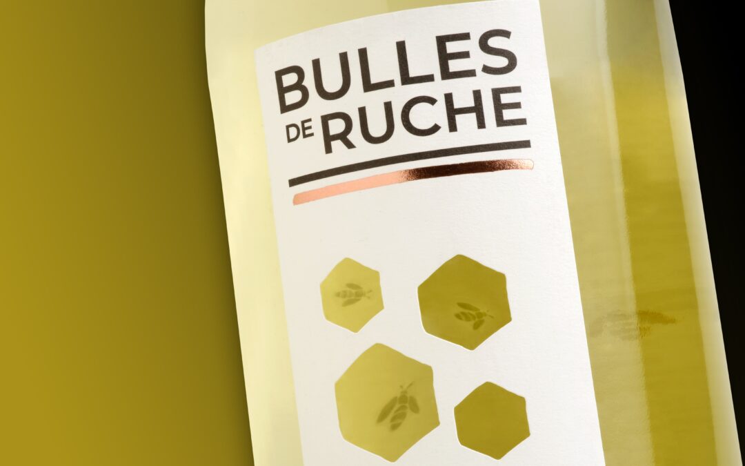
The subtlety of vitrophanie
For our client Beeche's Bulles de Ruche project, we had the opportunity to showcase our expertise in the play of textures and transparency. Indeed, the creation is based on the cutting of cells in the paper in order to let appear pretty little bees treated in...
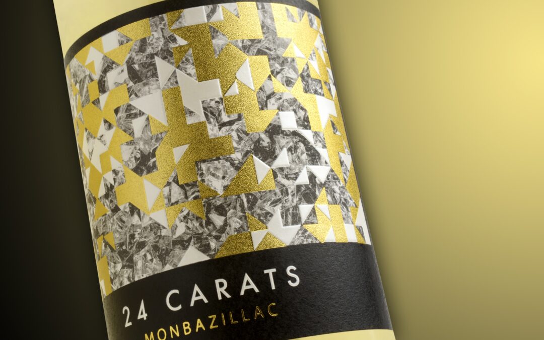
The hotfoil in the center of the creation
Here is a superb project that we were able to develop for our client the Domaine de Grange Neuve for its Monbazillac 24 Carats. Our objective? To achieve a premium creation, reminiscent of a rough diamond. Our agency Atelier 7 was able to meet the challenge with...
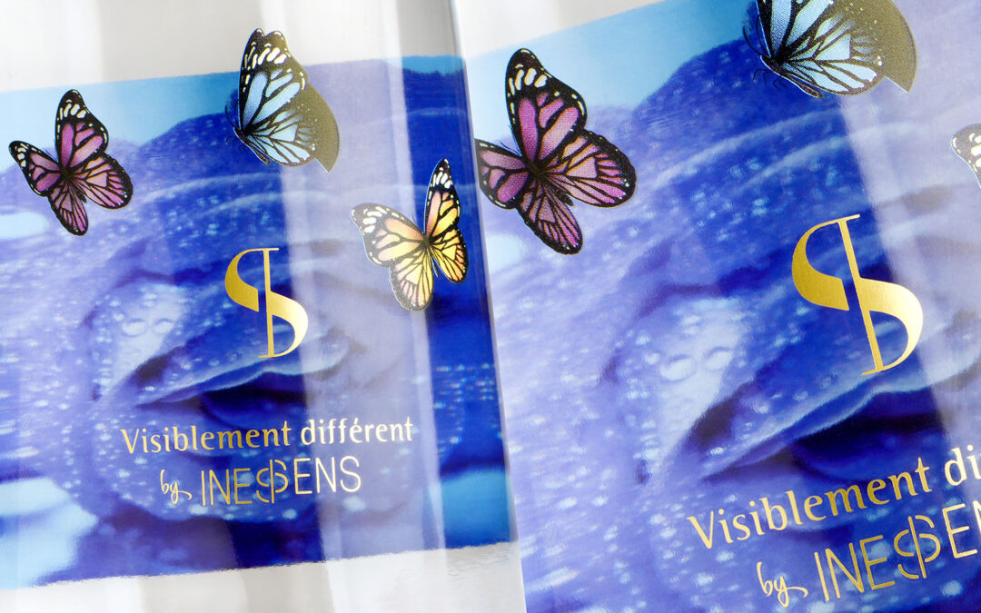
The vitrophanie or how to create an atmosphere around your product
An innovative solution dedicated to animate your products, Wines, Spirits, Champagne and Cosmetics.The back label printed on both sides subtly plays with the transparency of the product and reveals a decoration to add a depth effect with the front label. We can also...