
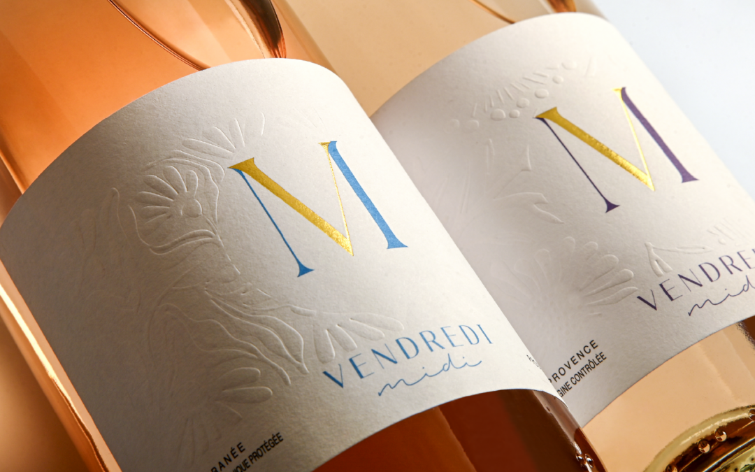
To dress its range of rosé wines, our client Vins & Territoires chose labels in which the material and finishes play a central role in defining the identity of each cuvée. The labels were produced by Roy, our printing house based in the heart of Burgundy.
The choice fell on Tintoretto Gesso paper, whose distinctive texture naturally brings character to the label.
But it is above all the use of embossing that sets the range apart. The background pattern on each label is created using a dry relief technique: a raised design produced without ink, playing with the light and inviting you to touch. The pattern varies according to the grape variety of each cuvée, giving every wine its own identity while maintaining a strong sense of coherence across the range.
To complement this work with texture, flat hot foil stamping subtly highlights selected elements of the design. It adds a touch of brilliance and elegance without overpowering the understated character of the overall design.
Have a label project in mind? Get in touch with us.