
News of the group
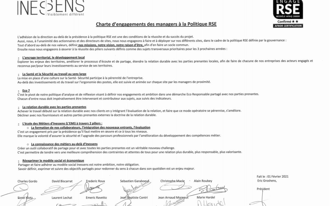
Our CRS Commitments
Writting, thinking, sharing with our Managers, our colleagues the main subjects linked to our CRS policy, have been strong acts at the beginning of the year to get each tojoin and get mobilised on all projects. We are very proud today to display in each of our...
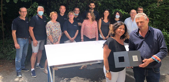
INESSENS has received Grasse Expertise Trophy!
We are proud to be part of the 55 members of Grasse Expertise, recognised for their skills dedicated to perfumes and their commitments to the territory of Pays de Grasse, in France. A big thank for their trust!
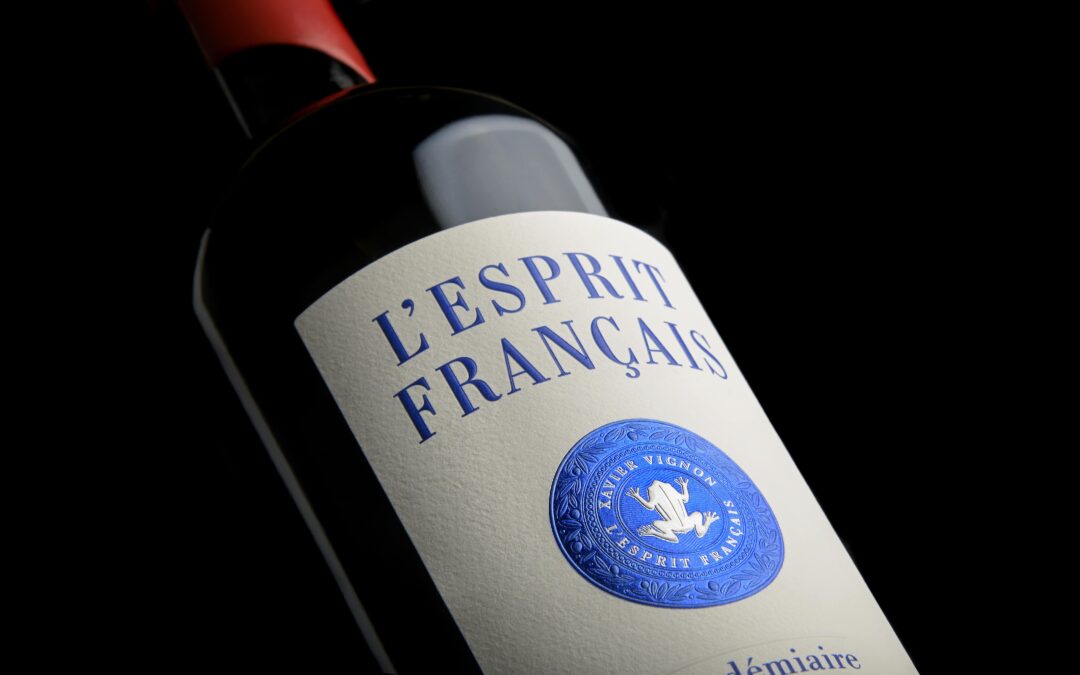
The micro-texture at the centre of the creation
Here is a beautiful label that we had the pleasure of developing for our client Xavier Vignon for his wine L'Esprit Français. Our mission, led by our designer and our feasibility department, was to ennoble the coat of arms by adding finesse and detail! In addition, a...
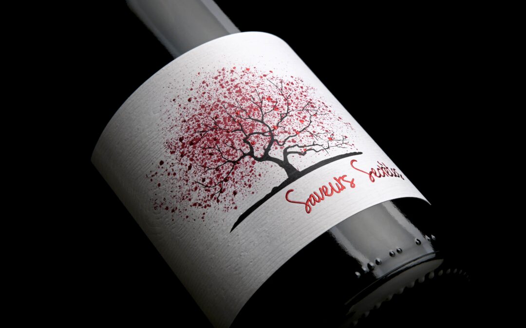
A textured support to give character to the label
We have been working for several years with our client Maison Gelin, who trusts us with our technical recommendations and the supports we recommend. This is why they also trusted us for their Saveurs Secrètes vintage! The objective for this cuvée was to bring...
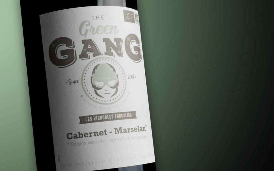
Foncalieu launches The Green Gang in conversion to organic and fully sourced and recycled
Our client, Les Vignobles Foncalieu, is launching a new product in conversion to agriculture, and invites you to participate in the protection of your territories by joining "the green gang".Eco-design is at the forefront: printed on a traditional non-adhesive...
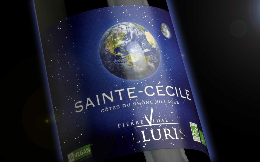
The Fresnel lens, the essential relief
We worked with our partner Pierre Vidal to enhance his Telluris label with our Fresnel lens! The aim being to take us into space, the lens was placed on the Earth to play on the relief. Following their realisation, we had a feedback from our client about our...
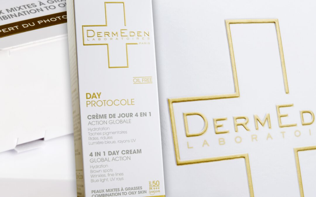
The premiumization of the boxes
We have worked with DermEden on its cases intended mainly for the export markets and which, with the cold marking, had some problems of resistance to transport.So we helped them to select a new material with a protective lamination to eliminate scratches.We then...
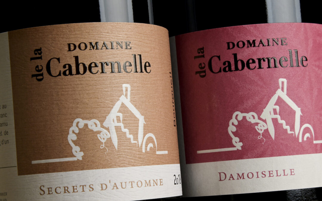
Our range of textured papers to enhance the design
We recently worked on new labels for Domaine de la Cabernelle, the objective being to modernize their wines. To do this, our client wanted to highlight its labels and wines with our range of textured papers that offer a real differentiating feature. For the label...
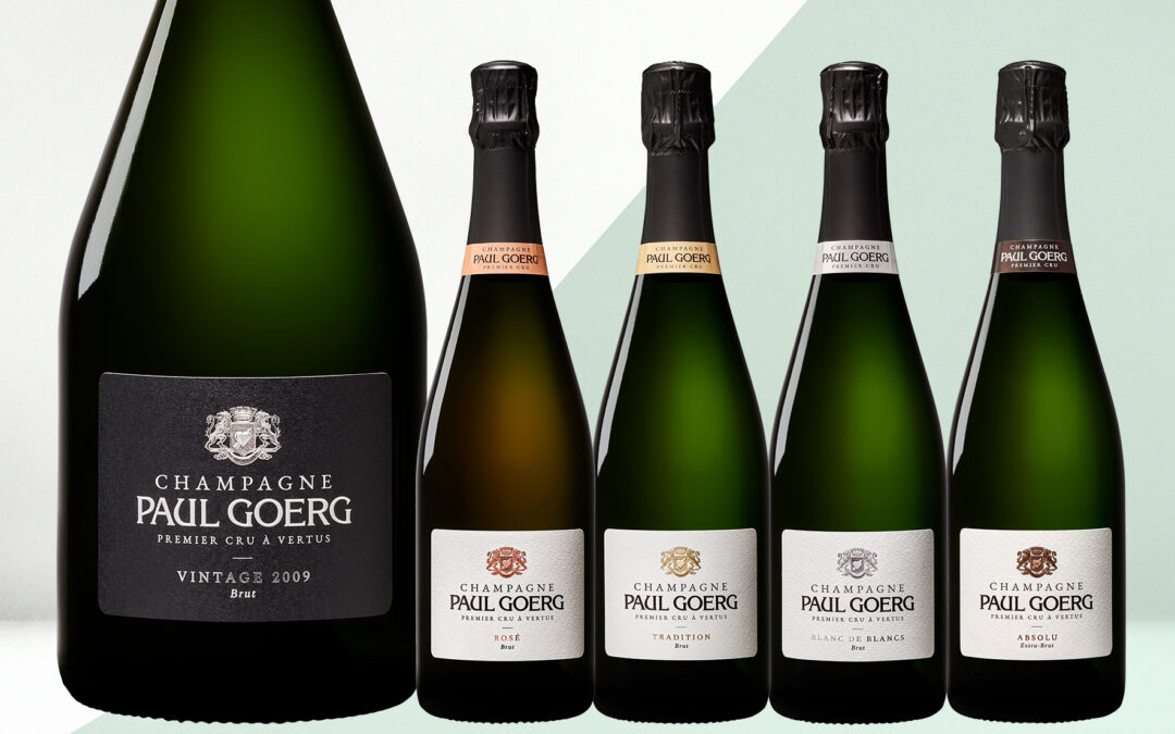
Champagne in simplicity and finesse
Our client Champagne Paul Goerg 1er Cru in Vertus, in the heart of the Côte des Blancs, is preparing to strengthen its presence in the high-end champagne market worldwide.To better illustrate its orientation towards excellence, the house is developing its brand...
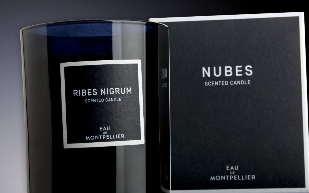
Assorted packaging
Our partner, Arthur Dupuy, specialized in the development of olfactory signatures, contacted us to rework its cases and labels where the deep blue countertype had to match the 2 supports. In view of its eco-responsible commitments, which favor short circuits and the...