
In the highly competitive world of whisky, standing out is essential.
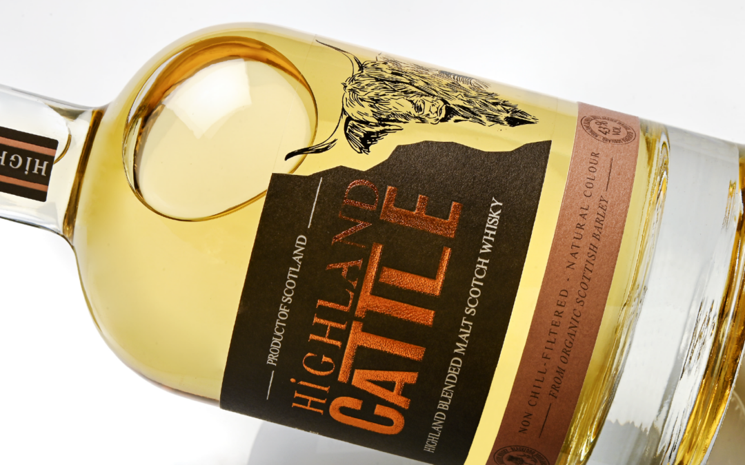
The Highland Cattle label relies on contrasts, materials, and textures to create depth and strong visual impact.
The combination of multiple substrates establishes a distinctive atmosphere around the product and reinforces the brand’s identity. The illustration, a powerful symbol, recreates the look of screen printing directly on the bottle — without its technical or budgetary constraints.
Thanks to its two-part wrap-around format, perfectly adapted to the bottle, and its embossed, textured gold foil, the label delivers a premium look that catches the consumer’s eye and enhances the authenticity of the whisky.