
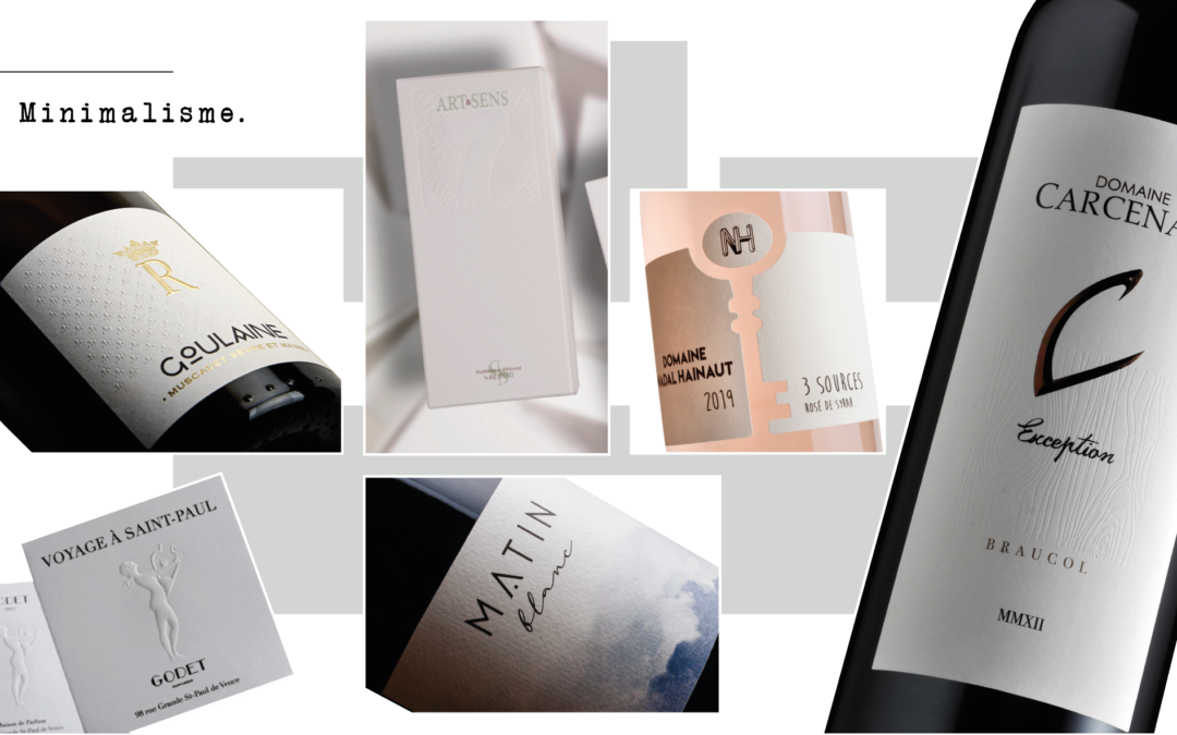
It has become a major, unavoidable trend, and is based on simplicity, clarity and efficiency. By focusing on the essentials, this clean visual approach creates visually powerful and memorable compositions. By reducing the number of visual elements, we manage to convey a clear and powerful message.
We can see this trend more and more today, both in decoration, fashion, graphic design and web design. It aims to structure the information and make sure it is easy to read.
Opposed to pop art, minimalism is the descendant of modernism.
Simplicity and Visual Clarity
Minimalism in graphic communication is characterised by a clean visual approach. It favors the use of simple shapes, neutral or limited colors, clean typography and empty spaces to highlight the main message. By reducing the visual elements to their essence, we manage to convey a clear and powerful message. Visual simplicity allows the audience to quickly grasp the intent and content of the design, while avoiding confusion or information overload.
Visual Hierarchy and Organisation
A key characteristic of minimalism is the establishment of a clear hierarchy. By simplifying the visual elements to a minimum, the most important information can be highlighted. The use of different sizes, colors, contrasts and positions helps to visually structure the information and direct attention to the essential elements.
Eliminate superfluous details
Minimalism encourages the elimination of superfluous details. By focusing on the essential, you avoid visual overload and you avoid distracting the audience with irrelevant elements. Each element present must have a specific function and contribute to the transmission of the overall message. By eliminating superfluous details, a clean and elegant aesthetic is created that draws attention to the main content.
Power of White Space
White space plays a crucial role in minimalism. These are the empty spaces that surround and separate the visual elements. Judicious use of white space helps to create a balanced composition and accentuate the elements present. It creates a visual breath, providing the eye of the beholder with moments of calm and clarity, an impression of lightness and sophistication, providing a pleasant and memorable visual experience, thus enhancing the visual impact of the design.
Durability and timelessness
Minimalism is often associated with a timeless and enduring aesthetic. By focusing on the essentials and avoiding fleeting trends, minimalist designs can remain relevant and attractive for long periods of time. This approach promotes a timeless and functional design that stands the test of time and avoids visual obsolescence.
OUR TIPS for creating a minimalist label:
- Simplify its design by avoiding the use of unnecessary elements
- Limit the number of colors (3 maximum)
- Give great importance to the choice of typography
- Avoid too many different textures, shadows or graphic designs
- Create a clean logo
- Prefer a solid background color
- Play with the textures or the paper of the product to reflect the values of the company
- Use unusual formats to reinforce the values of the company