
Our client Château de Sérame wanted to reduce its environmental impact as much as possible. The agency they work with, DITO DESIGN, knew that Inessens offered a collection of natural pigments. The aspect of the pigments is pastel, the design has to be created keeping this aspect in mind. The CLARENS paper, slightly textured, 100% French, FSC and carbon neutral, was logically chosen by our client for a large part of the products in its range.
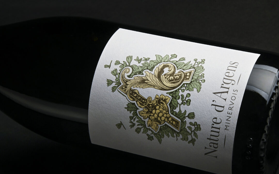
The name of the cuvée, written with a both elegant and timeless font, testifies to the respect of the estate for viticultural practices that respect the environment. You can see the logo of the Château d’Argens in the center, it embodies the elegance and nobility of this wine estate, with graphic elements representing the beauty of the surrounding nature, around it, a subtle illustration of the nature, adds a poetic touch to this label.
The label of the Nature d’Argens 2022 cuvée is an invitation to an authentic taste journey that respects the terroir, where simplicity and harmony with nature take on all their importance.