
Fonts are essential and take up more and more space on labels, and some printing techniques make them even more visibile. To give a new dimension to your labels, you have to know how to choose the font that will best illustrate the values of your product. It really is one of the key design elements to communicate to your consumers and represent your brand identity.
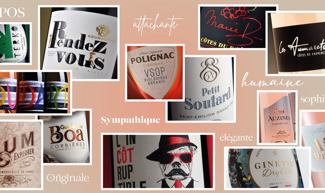
Serif typography remains timeless. The wheelbase is certainly formal but it has the ability to inspire consumer confidence. Serif typefaces also play on the nostalgic feeling and offer great creative freedom. In the category of serif typefaces, we also note the finely worked, sharpened, chiseled typefaces, with acute or straight angles, which give a sought-after and elegant aspect to the brand.
The handwritten font is also in the spotlight. It imitates manual writing, a bit old-fashioned, and will awaken the feeling of attachment, giving a more human side to the design. It attracts brands that want to play on a natural, traditional, even vintage side. Let’s also add a little softness and fluidity with an elegant, sophisticated and simple typeface, with narrow lines that remain legible!
A strong trend is found with so-called decorative fonts. The inside of each letter is decorated with flourishes, flowers, geometric shapes, patterns… which fill the words. Each letter thus becomes a drawing, another way of transmitting a message. Playful and friendly, it is perhaps this trait of originality that will make all the difference.
The Art Nouveau style is inspired by the curved lines of forms found in nature. These typefaces often contain elongated letters, embellished with ornamental elements. They make the creations unique and original, with a calligraphic or handmade aspect.
Nostalgic marketing also celebrates the trend of retro typos: round and colorful fonts straight out of the 80s. These fonts evoke joy, optimism and comfort.