
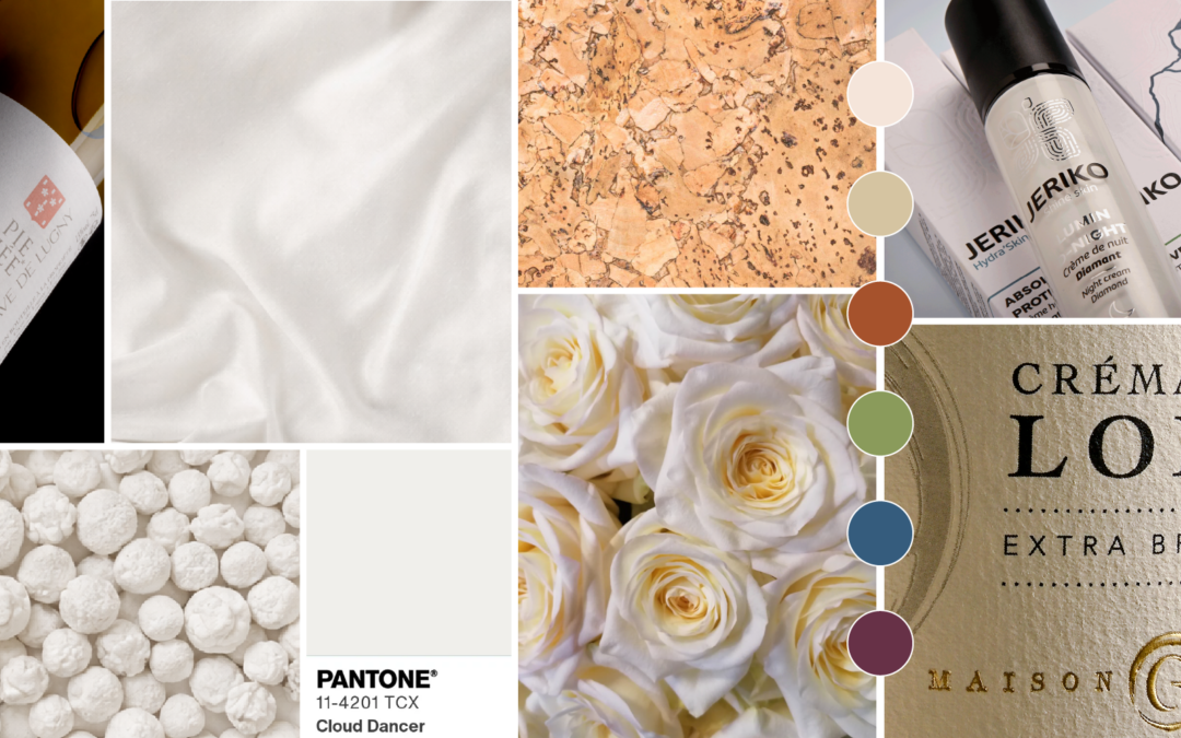
For the first time since the launch of its programme in 1999, Pantone has made a bold choice: a slightly off-white matte, christened Cloud Dancer. Far from being a trivial decision, this choice marks a genuine turning point in design trends.
A Colour That Breathes
Cloud Dancer embodies clarity, openness, and the quiet power of possibility. After years of vibrant, saturated colours clamouring for attention, we are offered… white.
But not just any white: a soft, almost cottony shade that invites you to pause.
Why This Colour Changes Everything for Packaging
The milky tones of Cloud Dancer instantly convey an impression of understated luxury, particularly valued in the world of cosmetics and skincare. There is no longer any need for gilding or garish colours to signal quality : the visual silence speaks for itself.
In practice, this shade works beautifully on:
- Rigid gift boxes and presentation cases that impress through their simplicity
- Beauty product cartons that play the purity card
- Minimalist labels where every detail matters
The Right Message at the Right Time
Pairing Cloud Dancer with eco-responsible materials sends a powerful dual signal: you care about aesthetics, but also about the planet. This combination creates a compelling message of visual simplicity and environmental integrity.
To take the approach to its logical conclusion, consider textured papers that evoke natural materials such as linen. To the touch, these papers tell a story of quality and authenticity that plastic can never hope to match.
How to Use It in Practice
According to Pantone, it can be paired with two types of palette: powdery pastels for a soft and reassuring feel, or more contrasting colours such as deep violet or rich blue to add depth and dimension.
A few pairing ideas:
- With pastel tones for wellness and lifestyle brands
- With black or bold colours for tech products
- With natural shades (beige, terracotta) for organic ranges
- With metallic accents (rose gold, copper) for premium collections
A Word from Our Graphic Designer at Atelier 7, Isabelle Evenat:
“Cloud Dancer, Pantone’s 2026 colour, marks a return to the essentials. This creamy, almost pearlescent white fits perfectly within the current trend for pared-back visuals and the codes of understated luxury.
I particularly enjoy pairing it with pastels : dusky rose, pale peach, celadon blue, to create soft, refined visual identities. On a label, Cloud Dancer brings that elegant restraint which today’s brands are increasingly seeking.”
Conclusion
Cloud Dancer represents a long-term shift, with designers using it to create premium packaging and less visually aggressive interfaces. In a saturated market, this “quiet luxury” approach could be your greatest asset for capturing attention and inspiring trust. The challenge lies in turning simplicity into differentiation, by combining noble materials, refined finishes, and authentic storytelling.
Have a project in mind? Contact us.