
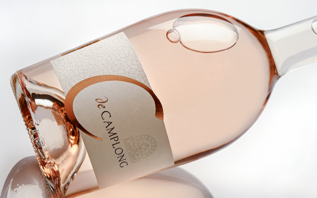
Debossing lies at the heart of this project, produced by the teams at our Roy print shop for Les Vignerons de Camplong. Applied across the entire left-hand side of the label, this selective pressure technique creates visual structure while delivering an immediate tactile experience.
At the centre of the design, light copper foil is applied to the large “C” and the word “de” in the cuvée name. The Les Vignerons de Camplong logo, meanwhile, is rendered exclusively through debossing.
The light copper foil brings a subtle golden warmth without overpowering the design, complementing the texture of the Tinto Gesso felt-marked paper, whose natural, matt finish reinforces the label’s understated character.
A flexographic varnish completes the finishing touches.
A fine example of how debossing can enhance a wine label, adding depth, presence and sophistication without excess.