
Introduction
In the world of cosmetics and perfumery, the label is far more than a simple carrier of information. It embodies the identity of the brand, reflects its positioning and contributes directly to the perceived value of the product.
Unlike other markets, where differentiation can come from the shape of the container or the price, here everything is in the detail: the choice of materials, the finesse of the finishes, the legibility of the information. The label becomes a strategic tool, at the crossroads of design, marketing and technical expertise. Analysing existing codes helps us to understand how brands structure their offer and how they use label design to establish their position.
Highly Structured Luxury Codes in Perfumery
The fragrance market remains strongly shaped by traditional luxury codes, with a pursuit of elegance, restraint and precision.
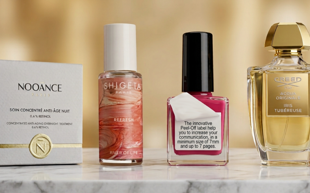
Perfume labels generally favour clean, uncluttered compositions: fine typefaces, rigorous centring and limited colour palettes. White, black, nude tones and transparent finishes dominate, often leaving the bottle to play the central role in the visual experience.
Finishes are used sparingly but with exacting standards. Gold foiling, for example, remains a must-have, but today it is expressed with greater control: delicate details, structural lines and discreet signatures. Techniques such as domed foiling add relief while preserving a great finesse of execution, instantly reinforcing the perception of premium quality.
Hot foil engraving is also frequently used for text and linear motifs, adding subtle relief and an artisanal dimension that recalls the historic codes of luxury perfumery.
Strong Segmentation in Cosmetics
Unlike perfumery, the cosmetics market is far more segmented, with very distinct visual codes depending on positioning.
Premium brands adopt codes close to those of fragrance: minimalism, quality materials and elegant finishes. By contrast, “clean beauty” and natural brands favour more authentic labels, with textured papers, soft colours and more organic designs.
In these worlds, the material becomes a key part of the brand’s message. Techniques such as micro-embossing make it possible to recreate natural textures on standard papers, adding relief and a more “living” feel to the label.
Dermatological and pharmaceutical brands, for their part, prioritise legibility and rigour: sans-serif typefaces, a clear hierarchy of information and functional design. Here, the label must reassure before it seduces.
Finally, more accessible or “mass market” brands rely more heavily on colour, visual effects and a multiplication of information to grab attention on the shelf.
The Central Role of Materials and Sensory Effects
One thing is common to the whole market: the growing importance of the sensory dimension.
Even in highly codified worlds, brands are looking to enrich the user experience from the moment the product is picked up. Touch is becoming a differentiating lever.
Substrates are evolving towards increasingly crafted papers: velvet finishes, pearlescent papers, specific textures and more. These materials immediately anchor the product in a given universe, whether soft, technical or natural.
Relief effects also play a key role. Tactile digital varnish makes it possible to highlight certain design elements with precision, creating a highly effective visual and tactile contrast.
An Increasingly Narrative Label
Beyond aesthetics, the label is becoming a vehicle for storytelling.
Consumers now expect greater transparency: the origin of ingredients, the product promise, environmental commitments. Brands must therefore include more information without weighing down the design.
This calls for suitable technical solutions. The booklet label, for example, allows additional content to be added while keeping a premium, attractive cover. It provides extra space to tell the brand’s story without compromising visual impact on the shelf.
Furthermore, some brands go a step further by introducing personalisation through variable data. Each product can thus feature a graphic or textual variation, strengthening the bond with the consumer and the sense of exclusivity.
Conclusion
The analysis of cosmetic and perfume labels reveals a subtle balance between established codes and the desire to stand out.
While perfumery remains rooted in highly structured luxury codes, the cosmetics market explores a wide diversity of expressions, ranging from premium minimalism to natural authenticity. In every case, materials, touch and quality of execution have become essential.
Yet behind these aesthetic choices lies a demanding technical reality. The success of a label depends on the ability to combine design, materials and printing processes, while respecting industrial constraints.
It is in this mastery that the value of Inessens lies. By supporting brands from the very earliest stages of design, offering innovative solutions and guaranteeing flawless execution, Inessens turns a creative intention into a genuine object of value.
Today, more than ever, the label is a strategic element of cosmetic and perfume packaging: a detail that makes all the difference.