
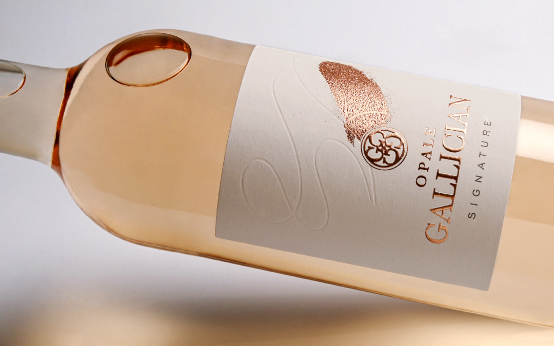
Our graphic design studio, Atelier 7, created the artwork for the Opale label, the rosé wine from Gallician Signature. The aim was to reflect the wine’s identity without overdoing it.
What we used:
- Textured Tinto Gesso paper
- Blind embossing to create a subtle interplay of textures
- Micro-textured foil stamping as a distinctive signature
- Embossing to give the brand name added depth
- The detail that makes all the difference: a touch of powder pink at the heart of the label
This label was produced at our Roy printing site.
Our client’s testimonial:
“The result was an exact reflection of what we wanted: clean and understated, with textured paper, the signature at the heart of the design, and that little something extra… Very design-led, clean, understated and clear, it really brings the story of our cuvée back to life. A project that our partners are very happy with.”
Frédéric Bergeron, Sales Director at Gallician Signature
A great project, brought to life hand in hand with our client.